
Responsive Web Design That Looks Great Everywhere
We build mobile-first, responsive websites that provide excellent user experiences on every device.
Seamless Experiences Across All Devices
Our responsive web design services ensure your website looks and functions perfectly on desktops, tablets, and mobile devices.
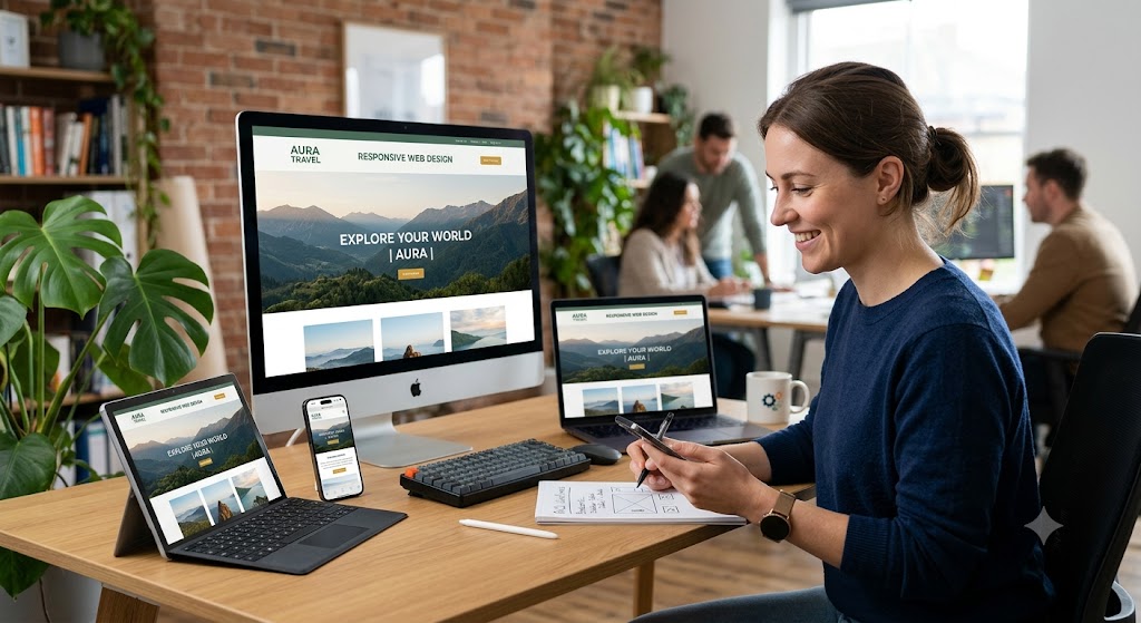
At Webvire, we create responsive and user-friendly websites that deliver a seamless browsing experience across desktops, tablets, and mobile devices. Our designs automatically adapt to different screen sizes without compromising functionality or visual quality.
We focus on clean layouts, intuitive navigation, fast loading speeds, and mobile-first design principles to ensure your website is easy to use and engaging on every device. Every element is carefully designed to provide a consistent and professional user experience.
Our responsive development approach also considers accessibility, performance, and SEO best practices, helping your website reach more users, improve engagement, and achieve better search engine visibility.
Build Your Responsive WebsiteMobile-Friendly Design
We design websites that work smoothly on smartphones and tablets, providing an intuitive experience across all screen sizes.
Better User Experience
Clear layouts, easy navigation, and optimized content help users find information quickly and interact comfortably with your website.
Performance & SEO
We optimize responsive websites for speed, accessibility, and search engine visibility to improve engagement and online reach.
Consistent Experience
Your website maintains a professional appearance and consistent functionality across desktops, tablets, and mobile devices.
Empowering Innovative Global Brands & Enterprises